Project "Office" is complete! - how I got there in the end.
/Well…that was a labour of love! I can quite honestly say that I have never put so much effort into redecorating one room! But boy, am I pleased with the results!
What I did….
On the walls
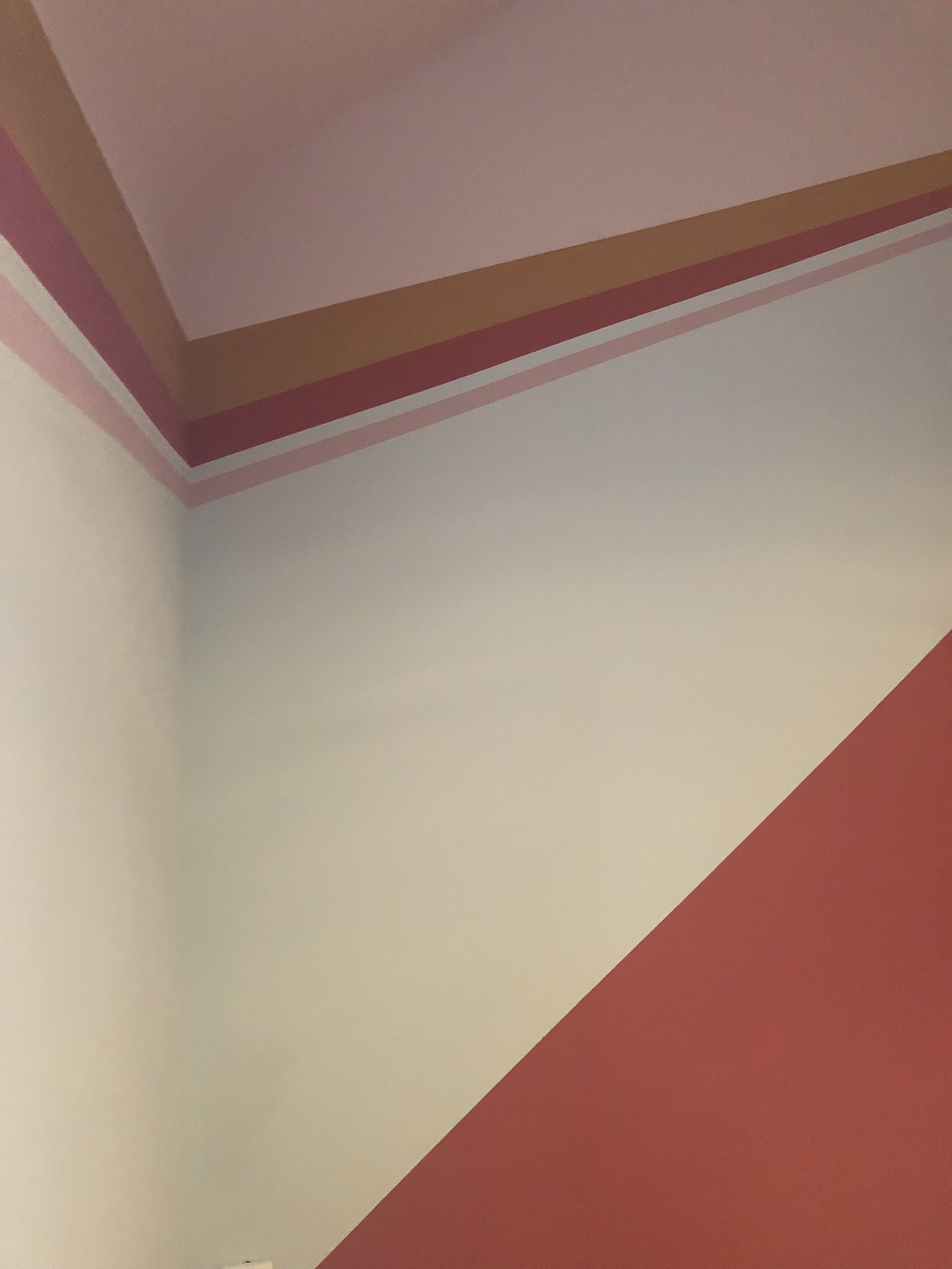
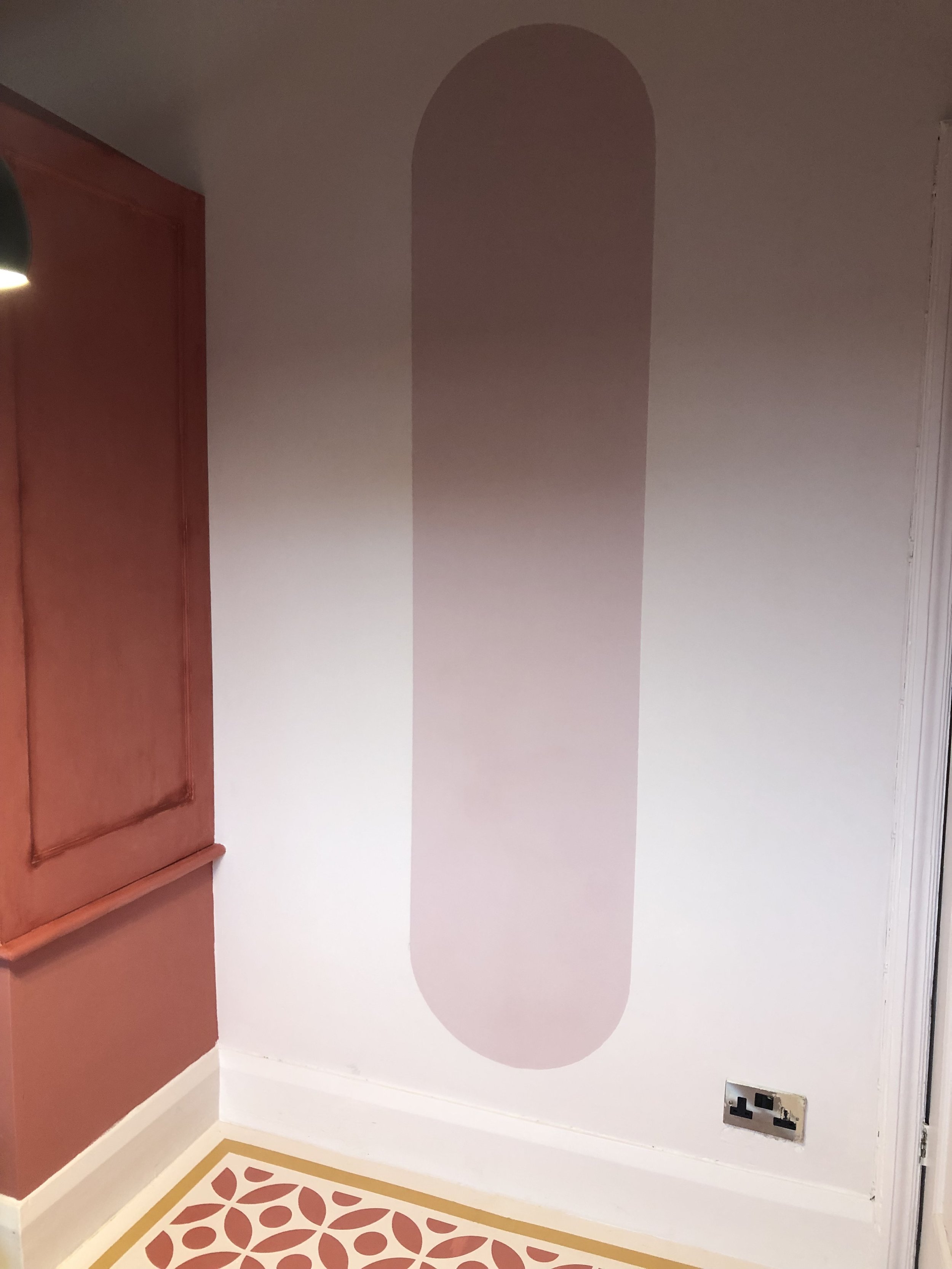
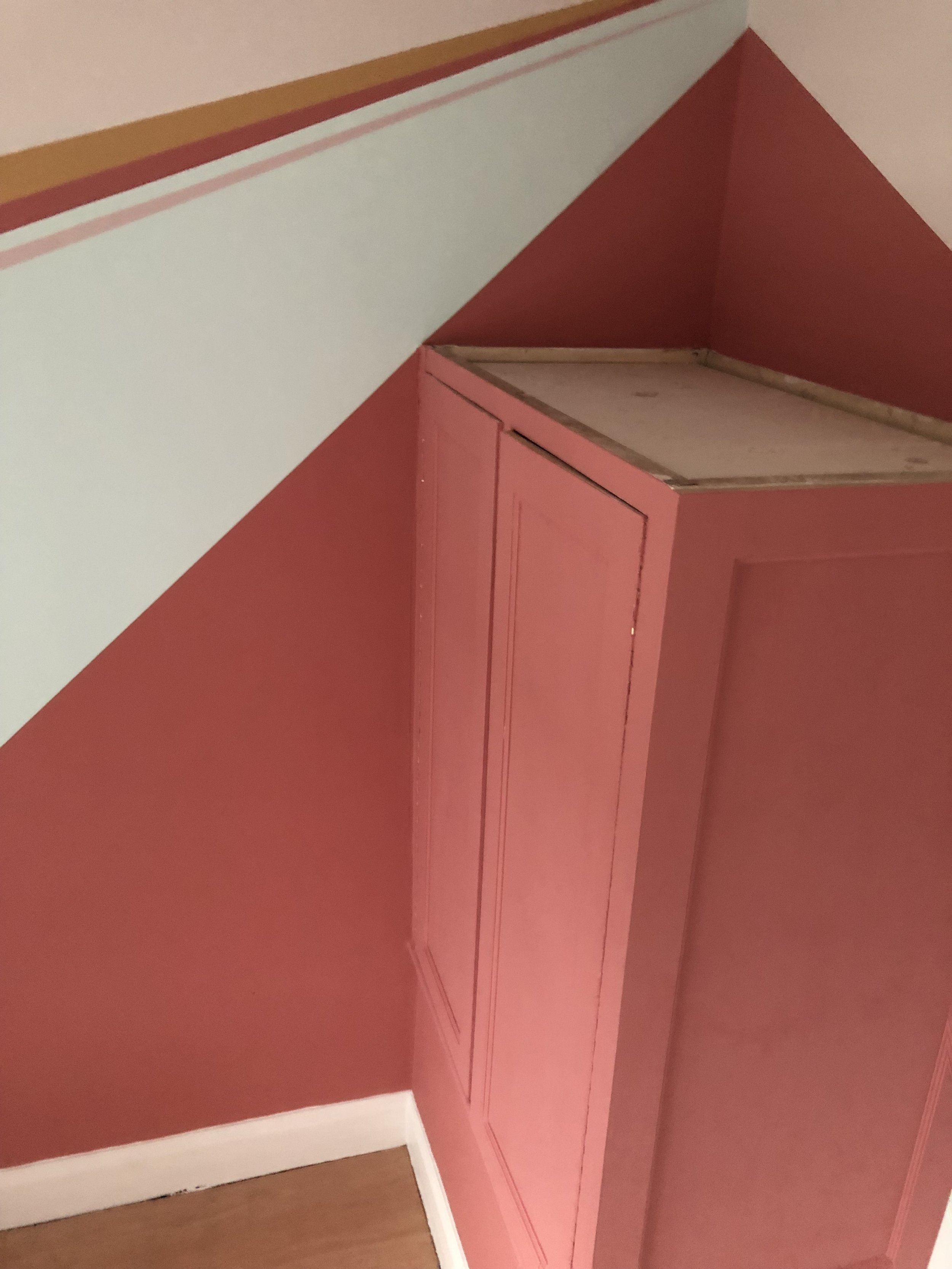
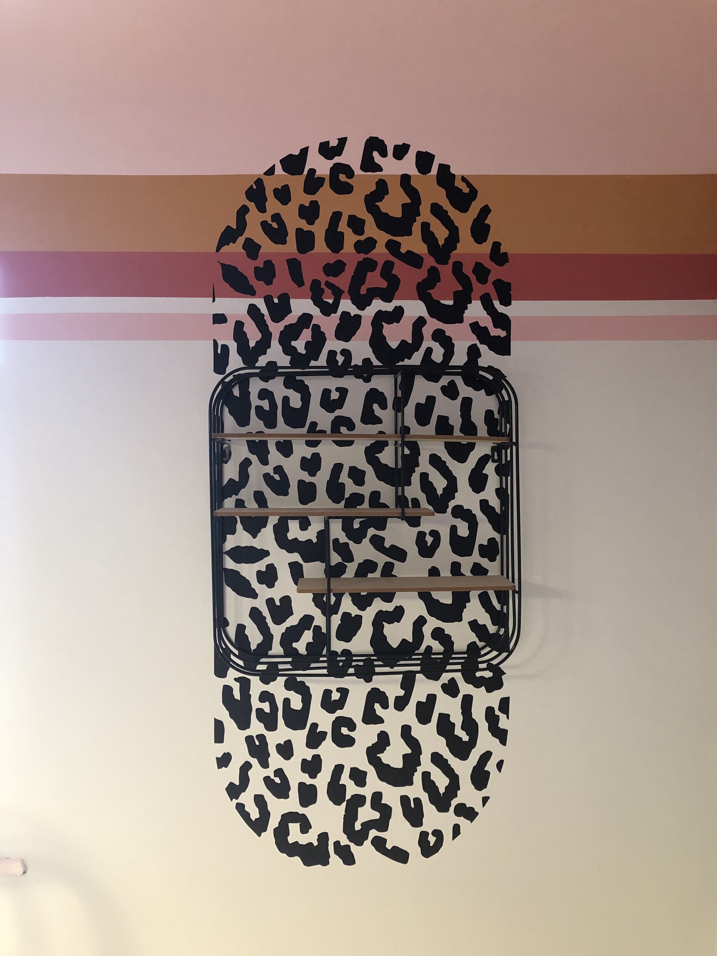
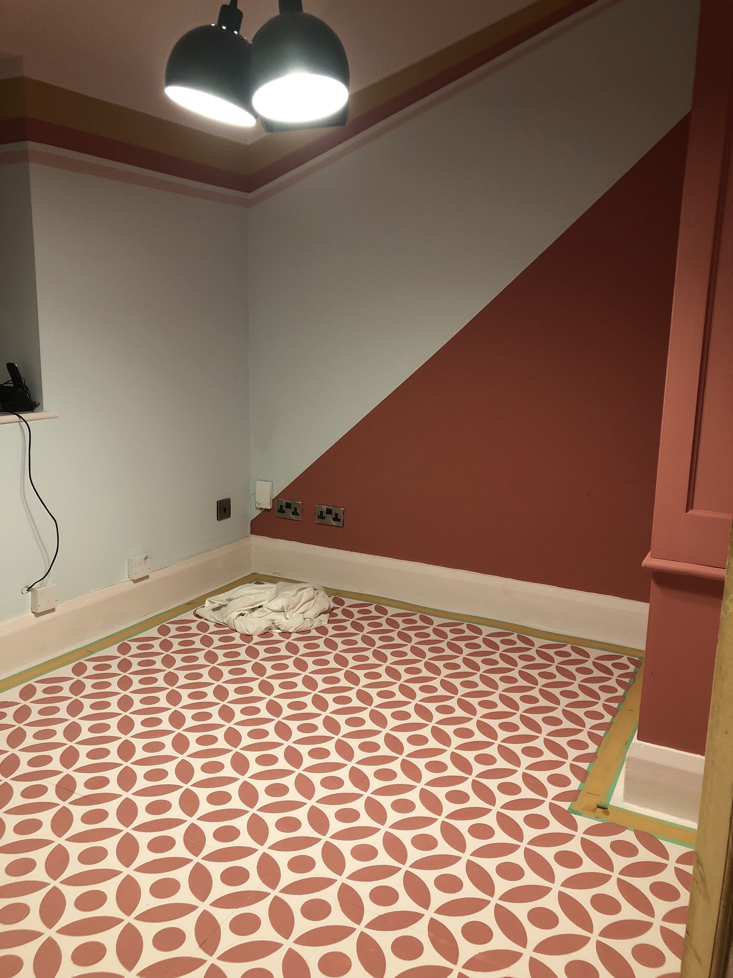
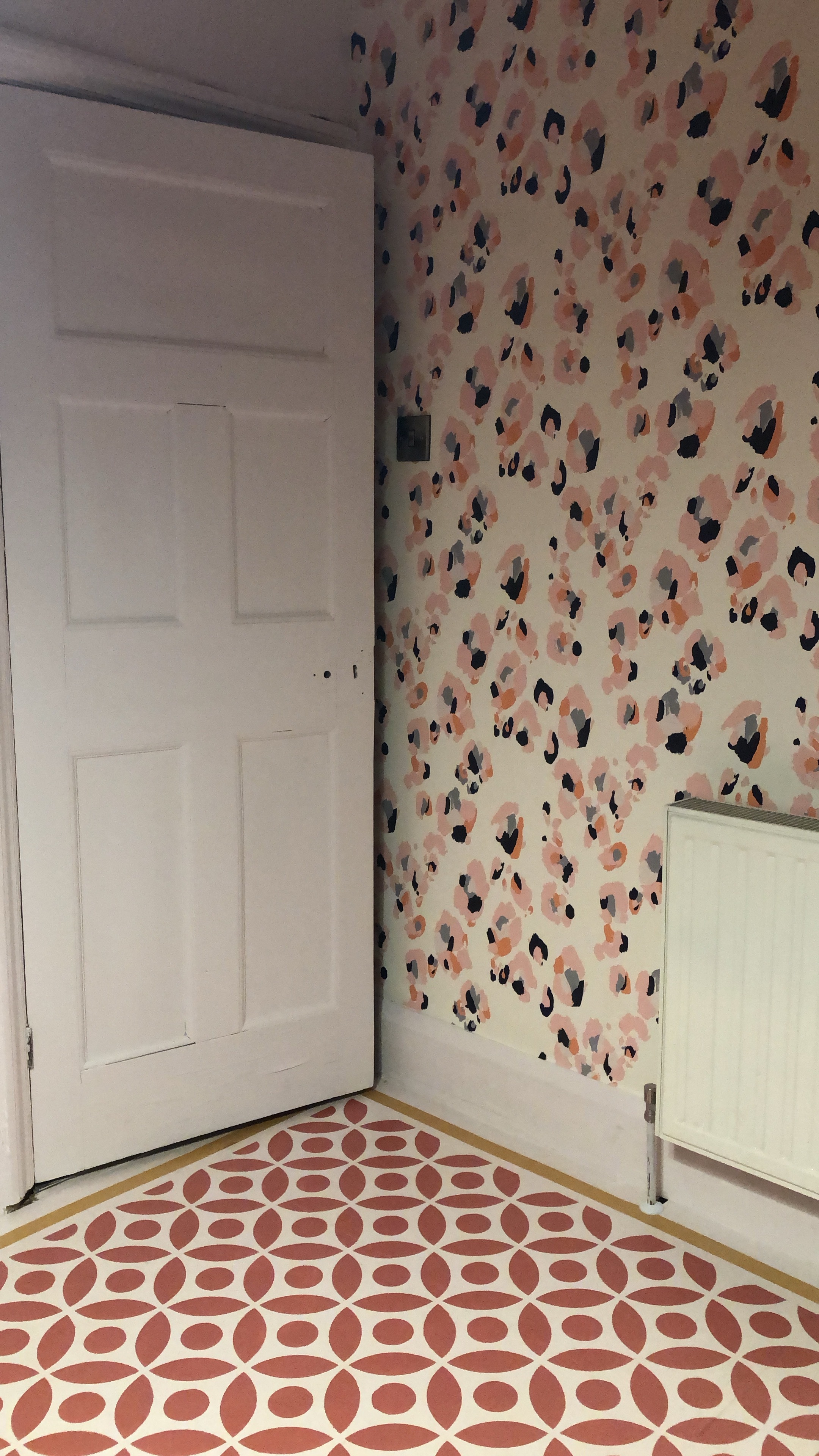
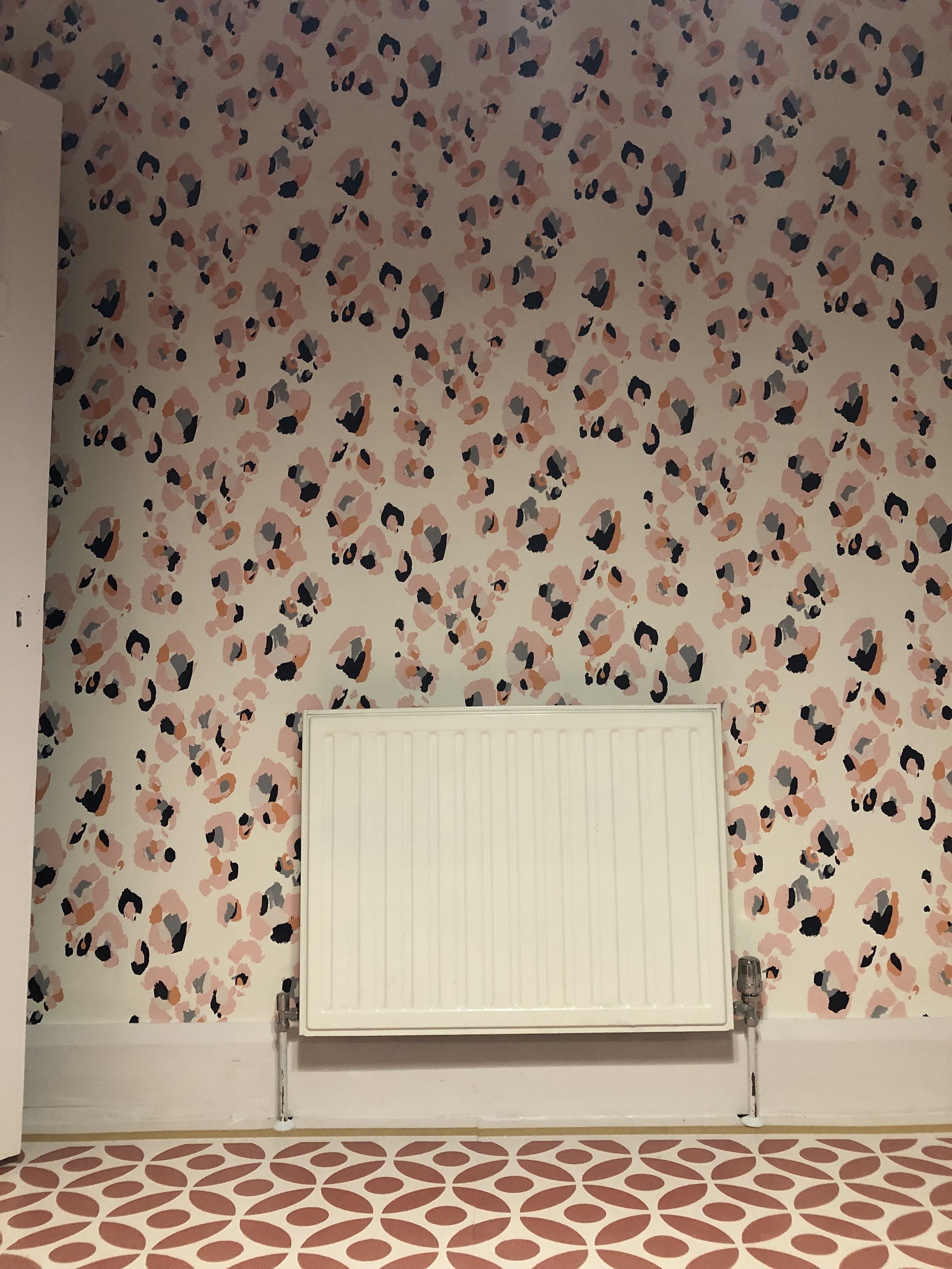
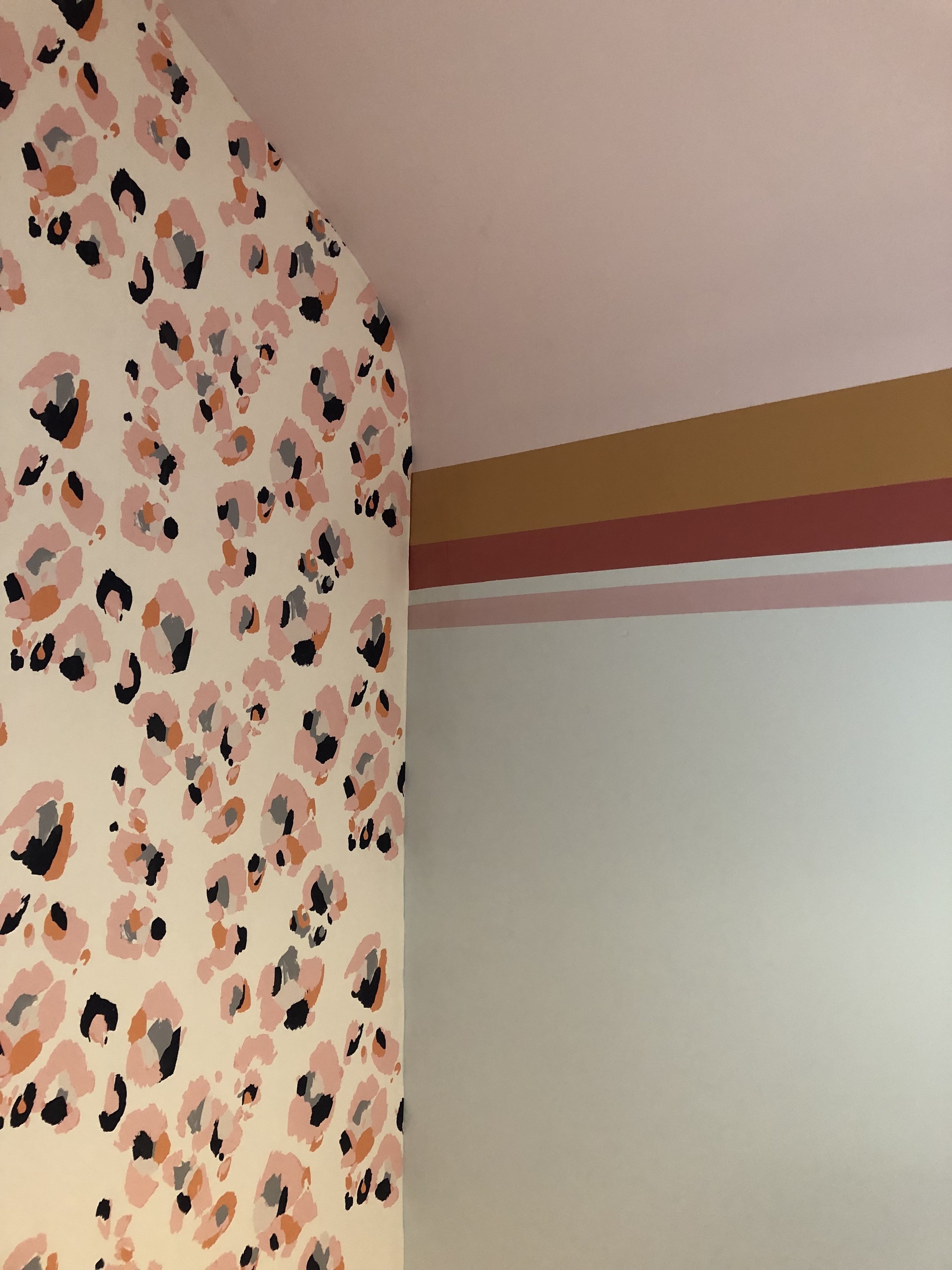
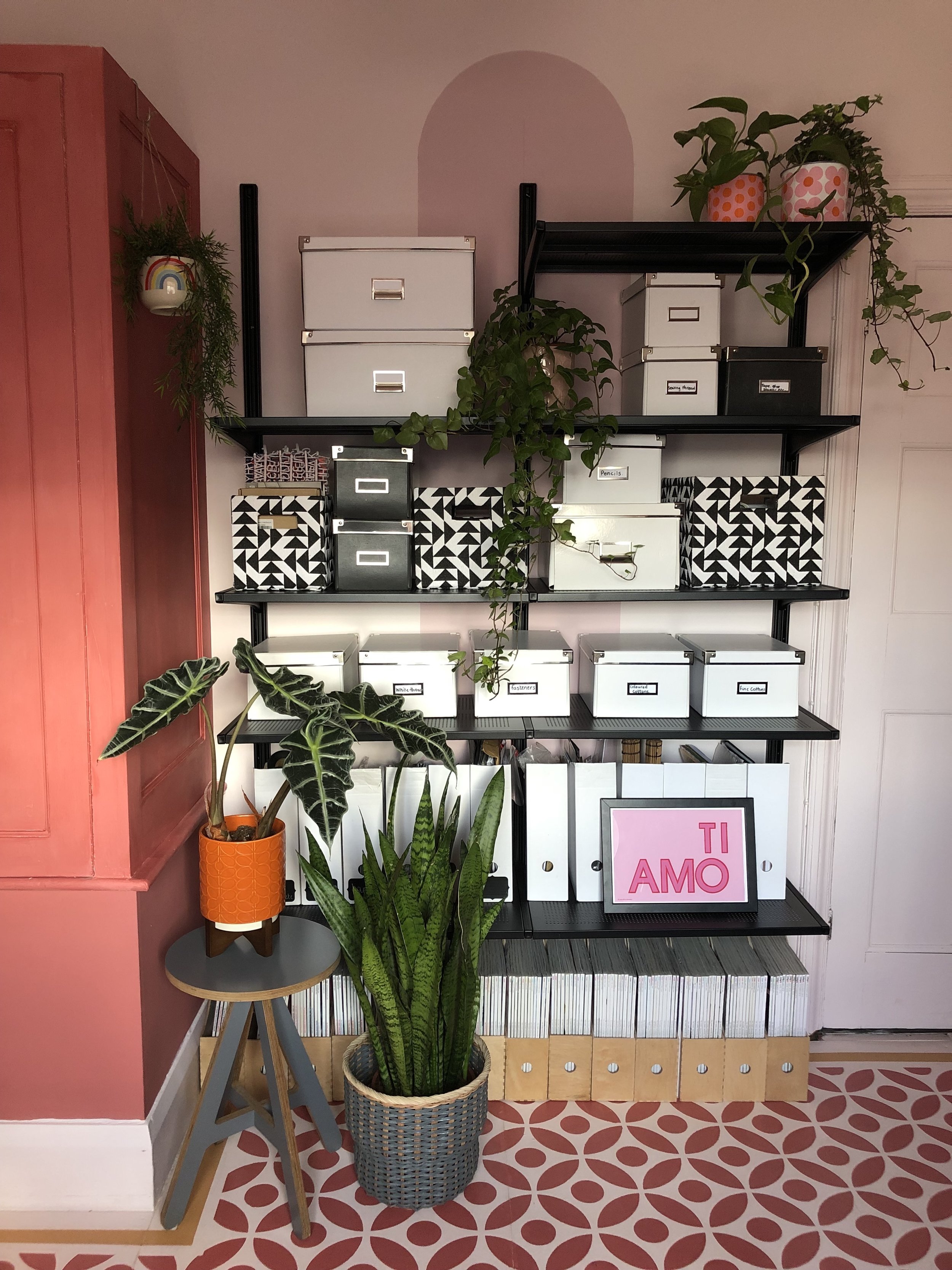
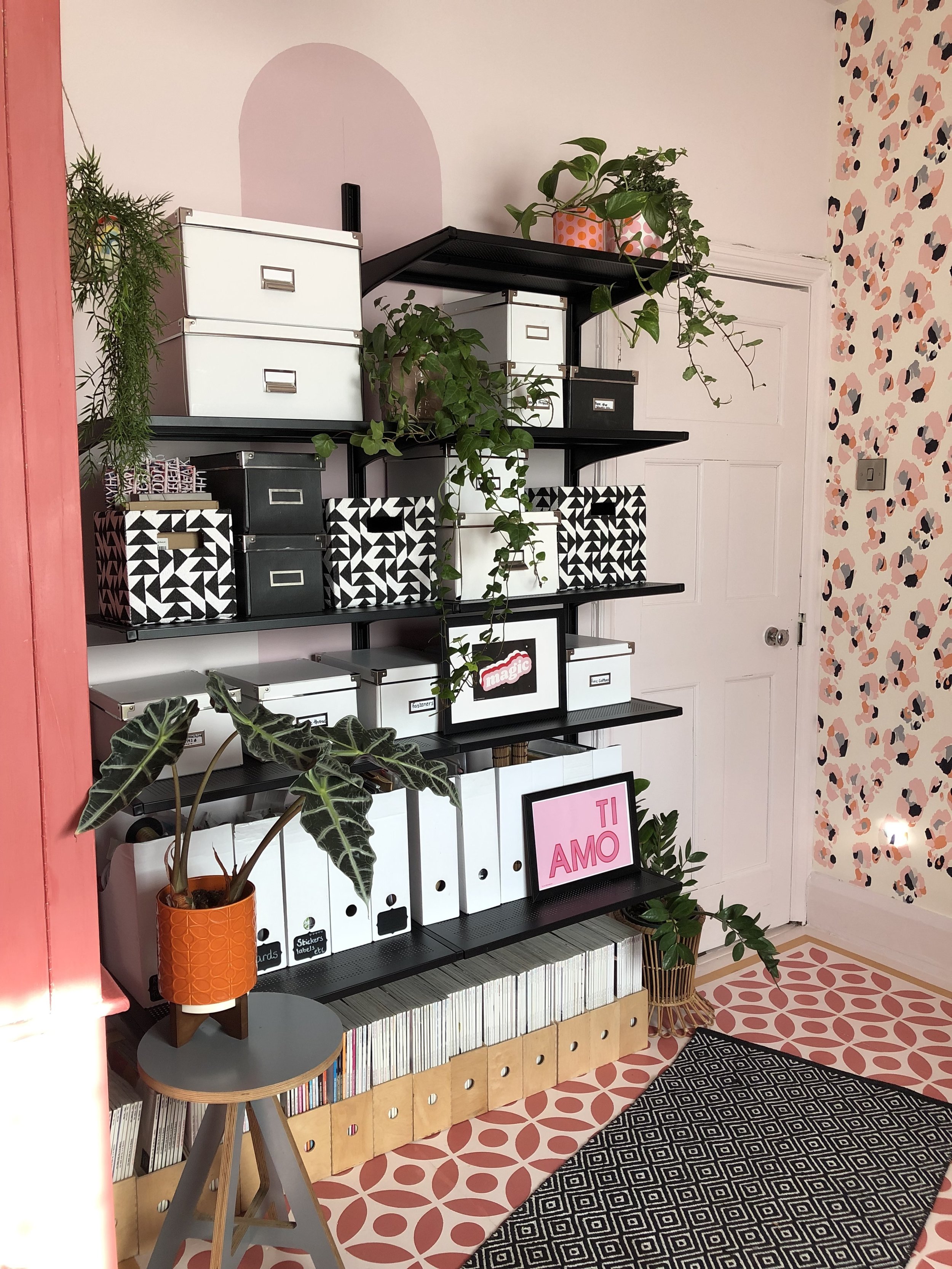
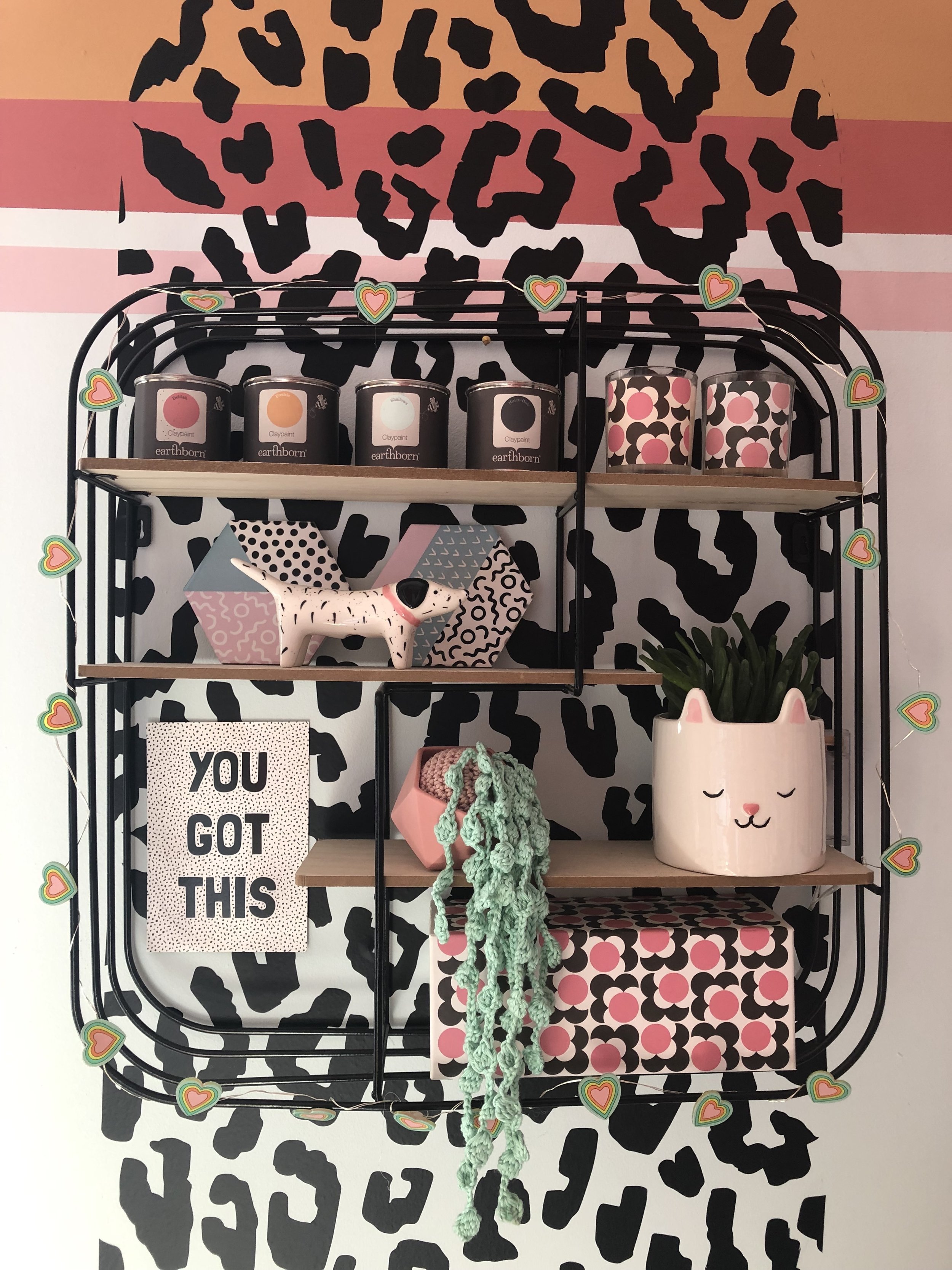
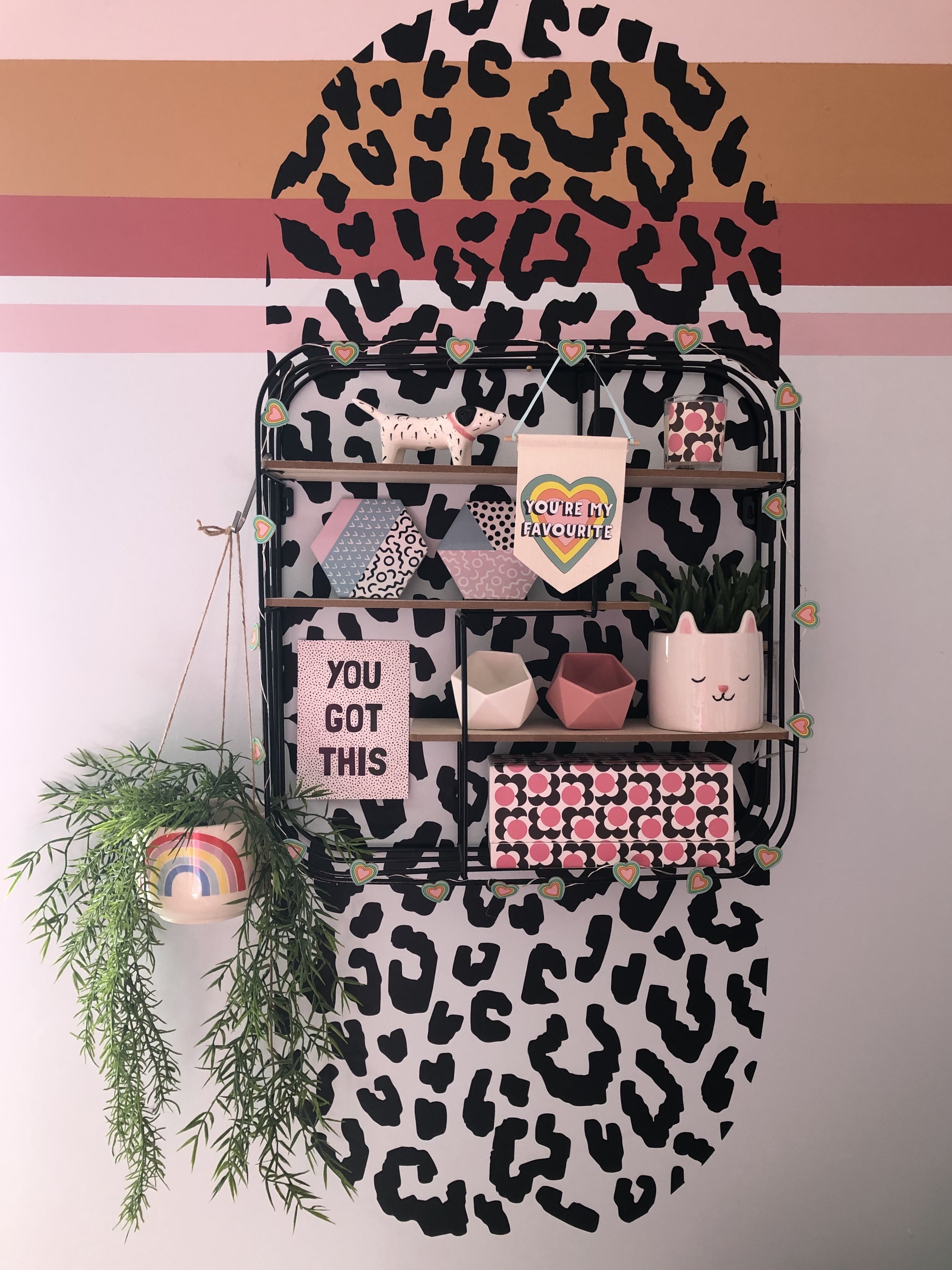
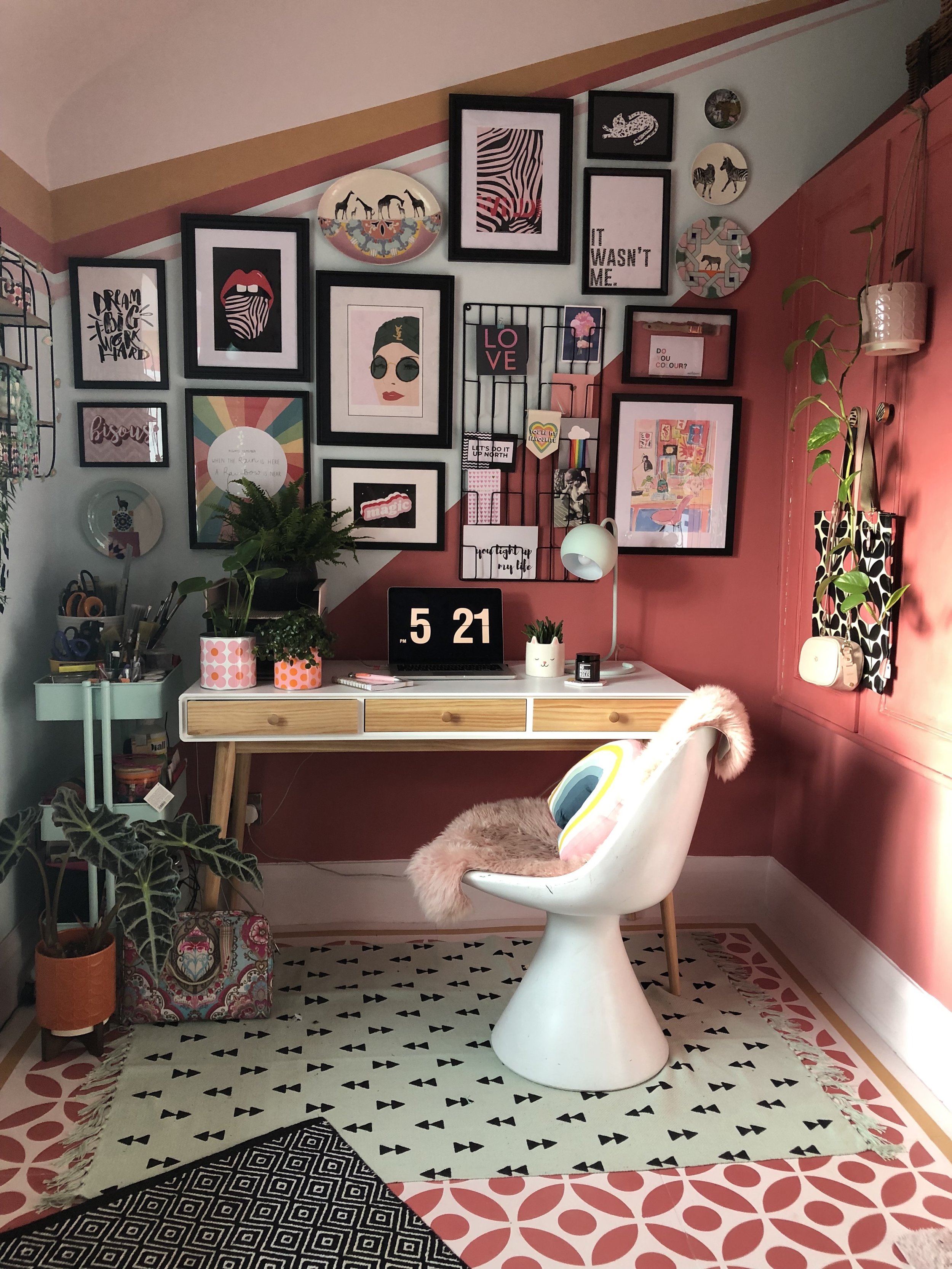
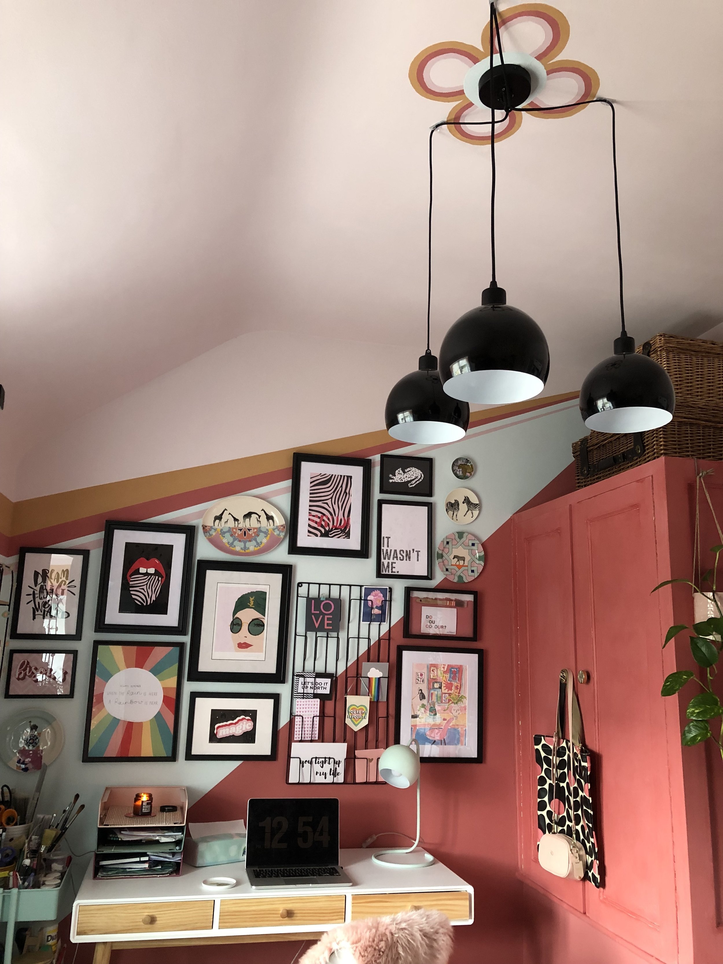
I went all out on colour and pattern in this room, as I had planned, using a palette of 6 Earthborn claypaint colours. Along with 2 full rolls of masking tape, a laser spirit level and a very steady hand, I created stripes that wrap around the room bringing the colour scheme together. I wanted to incorporate the ‘Lozenge” shape, a trend that’s all over the interiors world right now and one I’m really rather partial to, so I painted the Rosie Posie pill shape on the wall behind the shelves. I did this by using the laser level and masking tape for the sides & then created a cardboard semi-circular template (drawing 1/2 way around a tray) to make the curved shape for the top and bottom. I then repeated this shape using leopard spot wall decals from Nutmeg Wallart on the opposite wall.
On the floor.
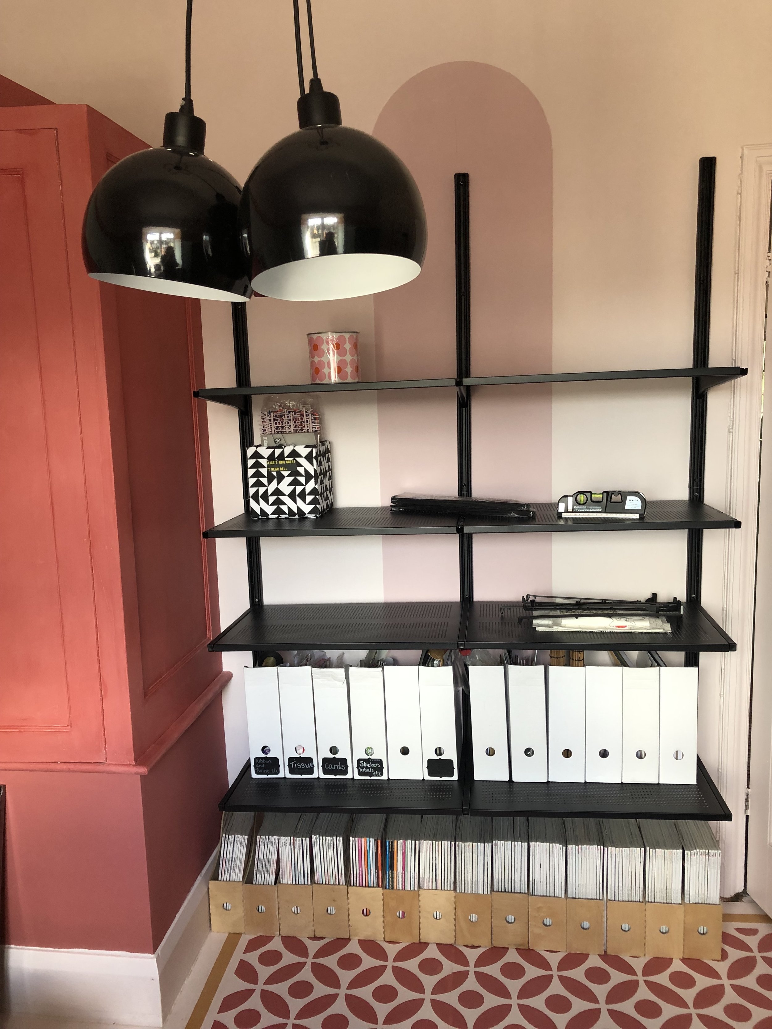
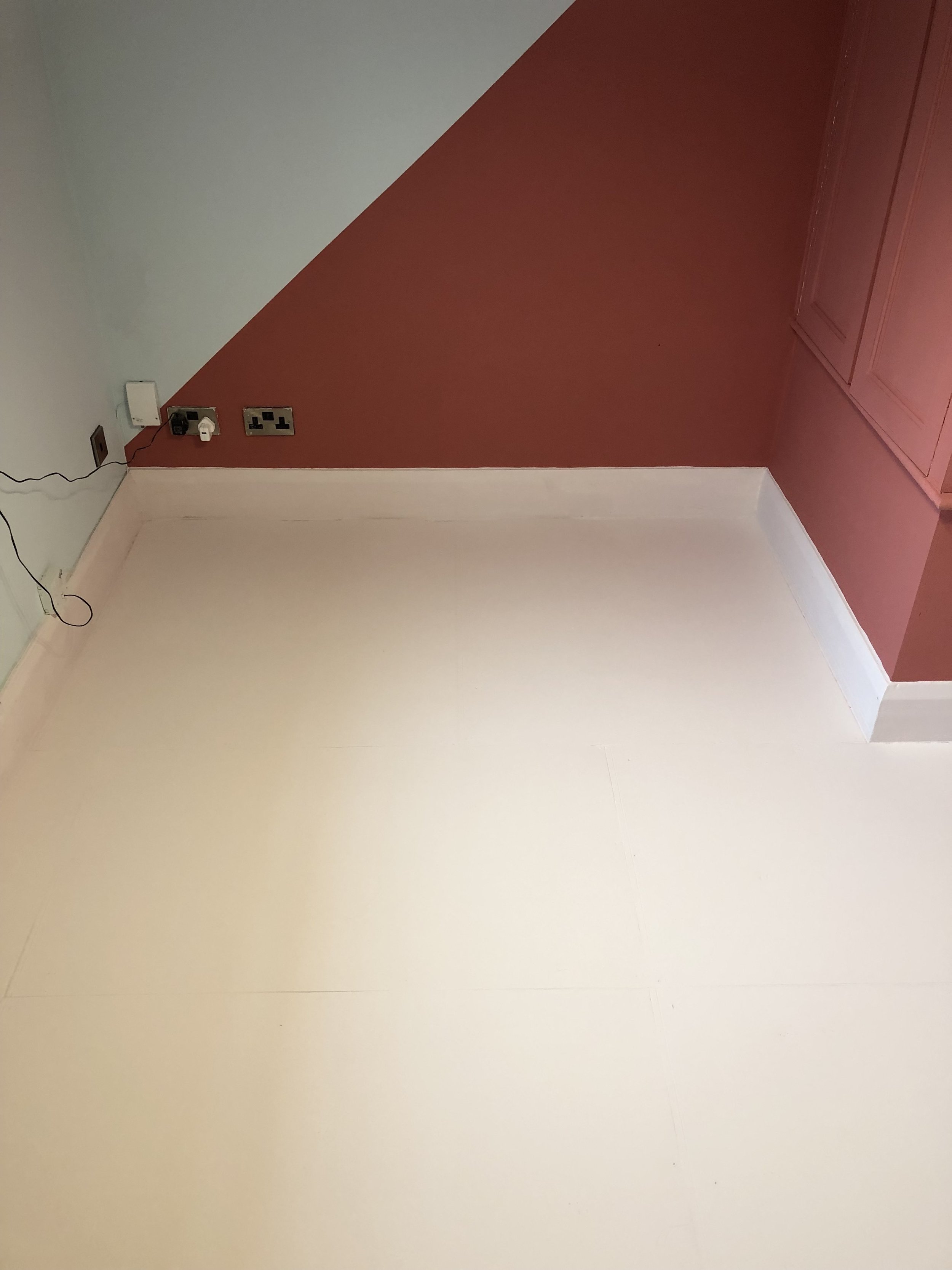
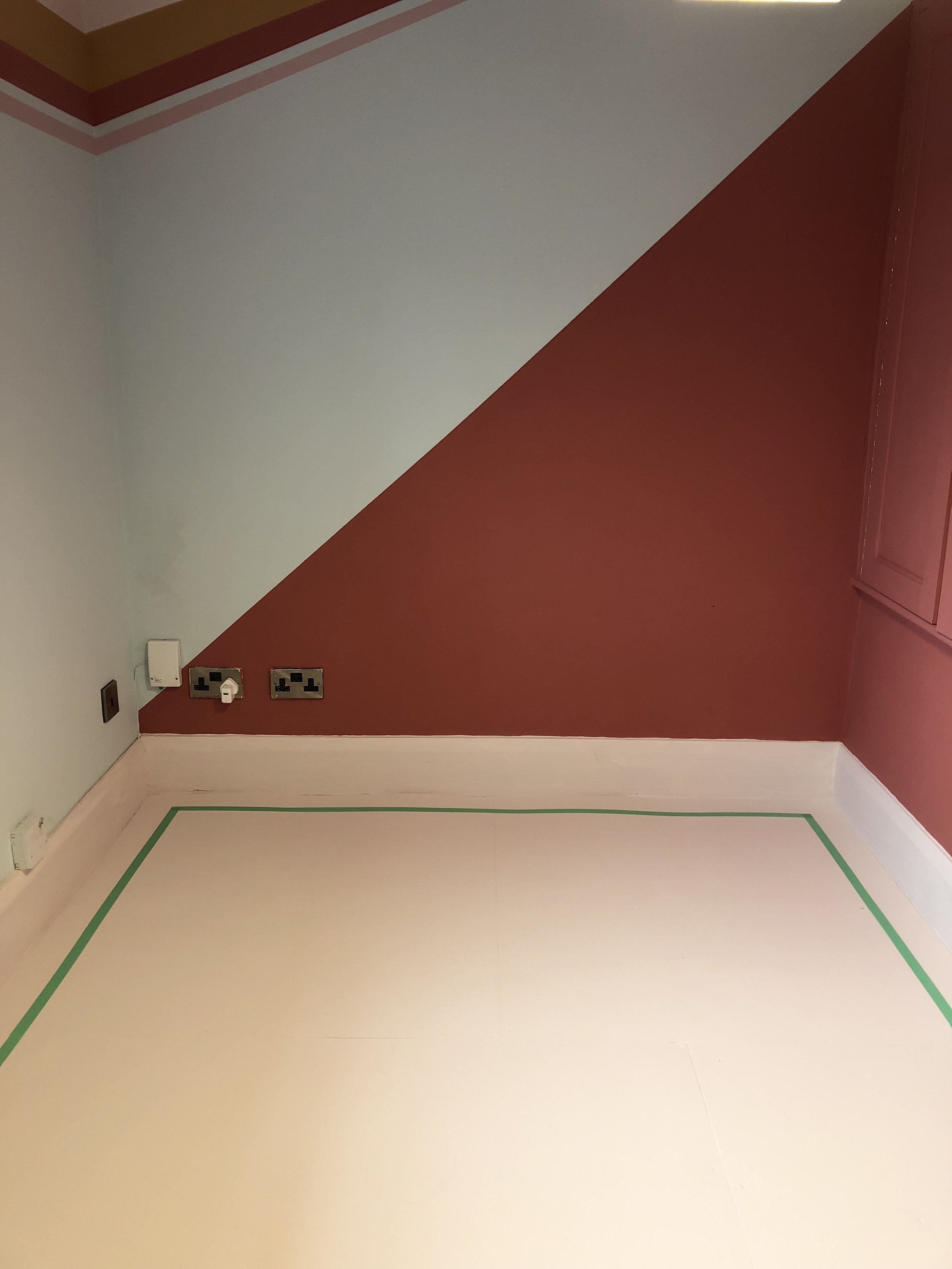
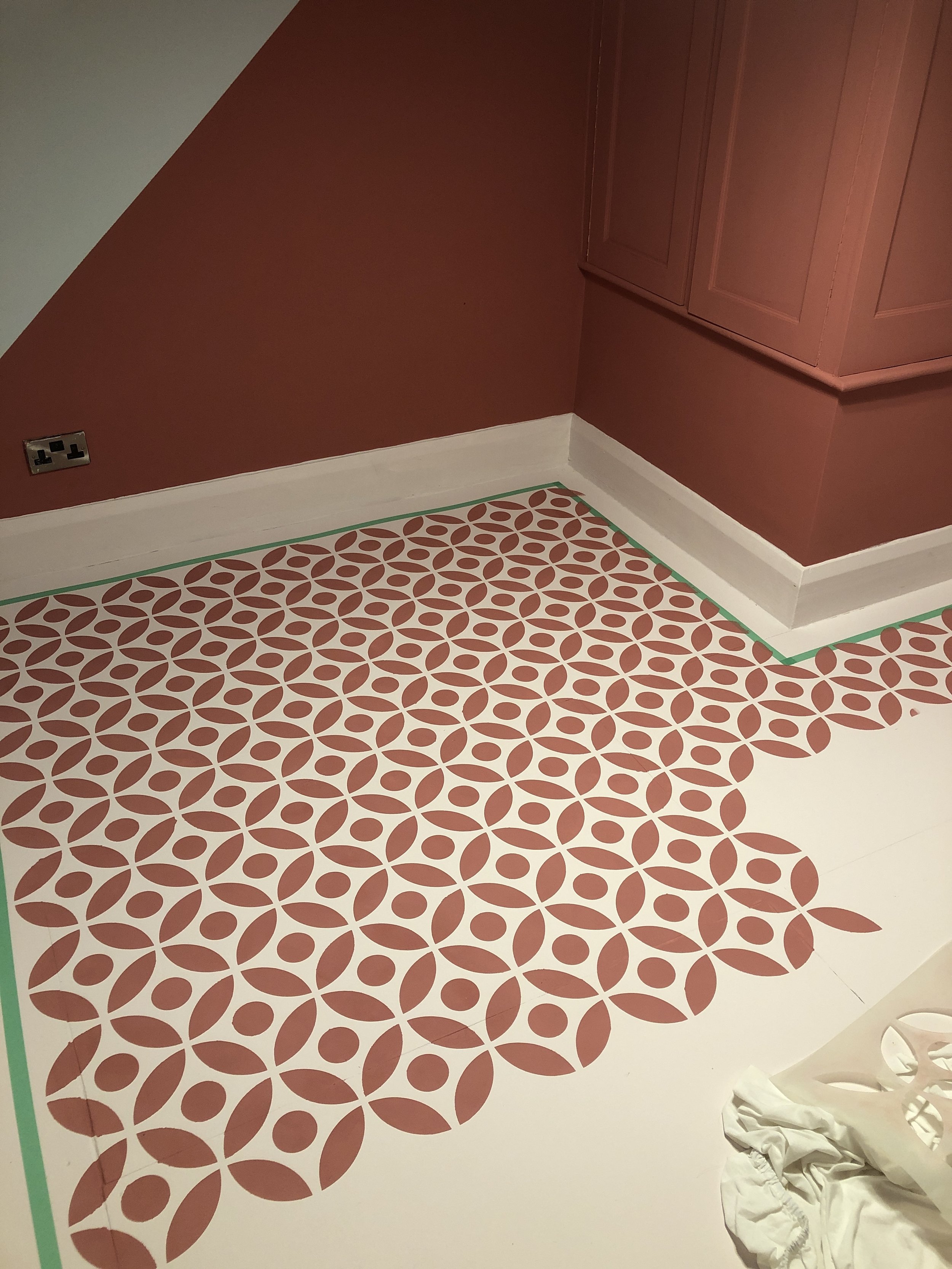
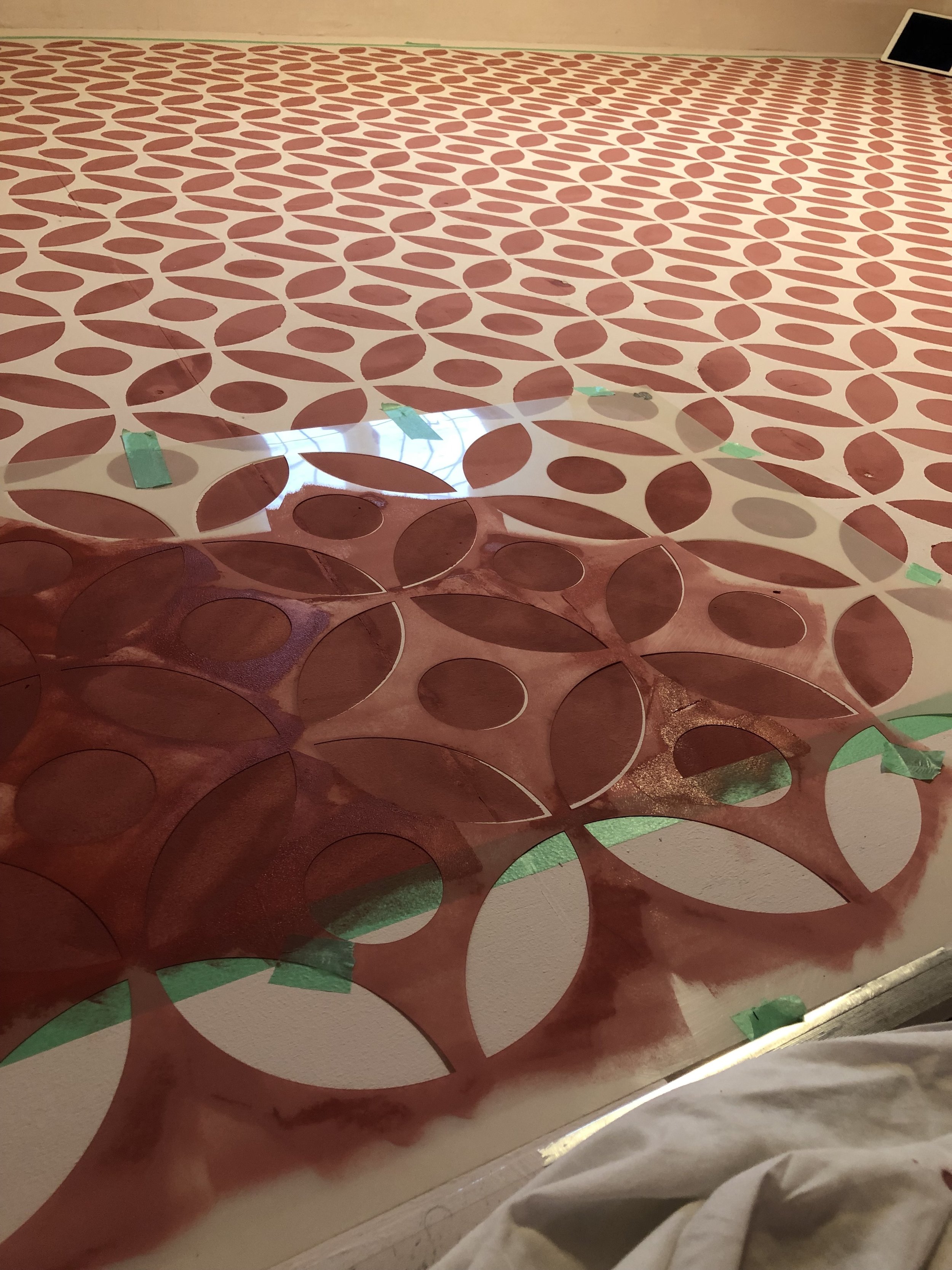
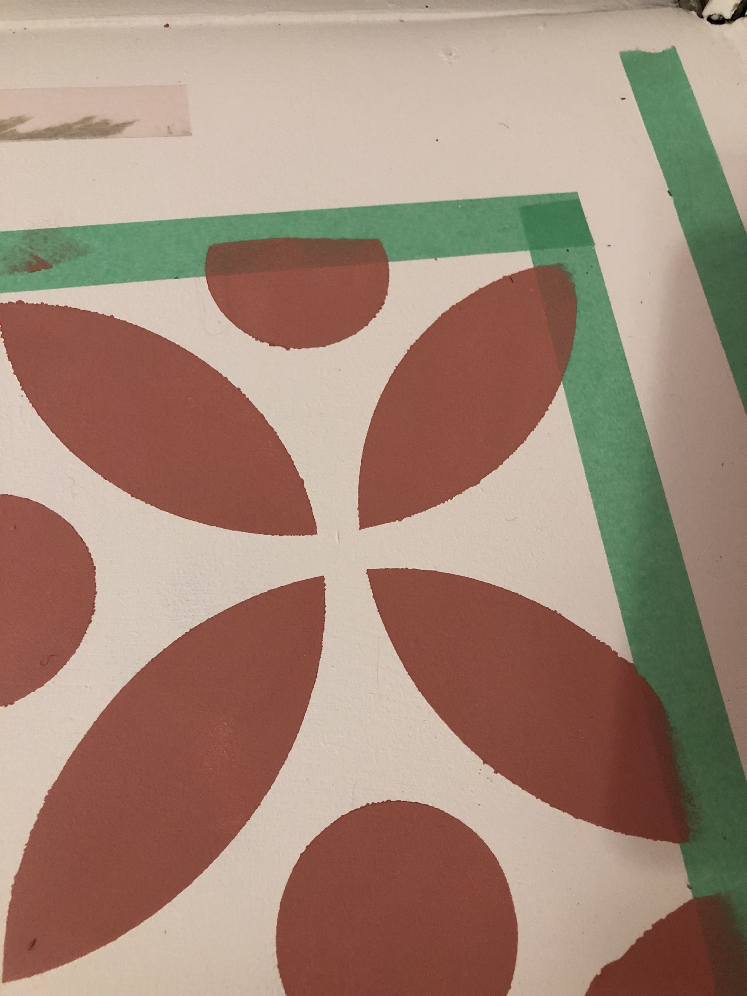
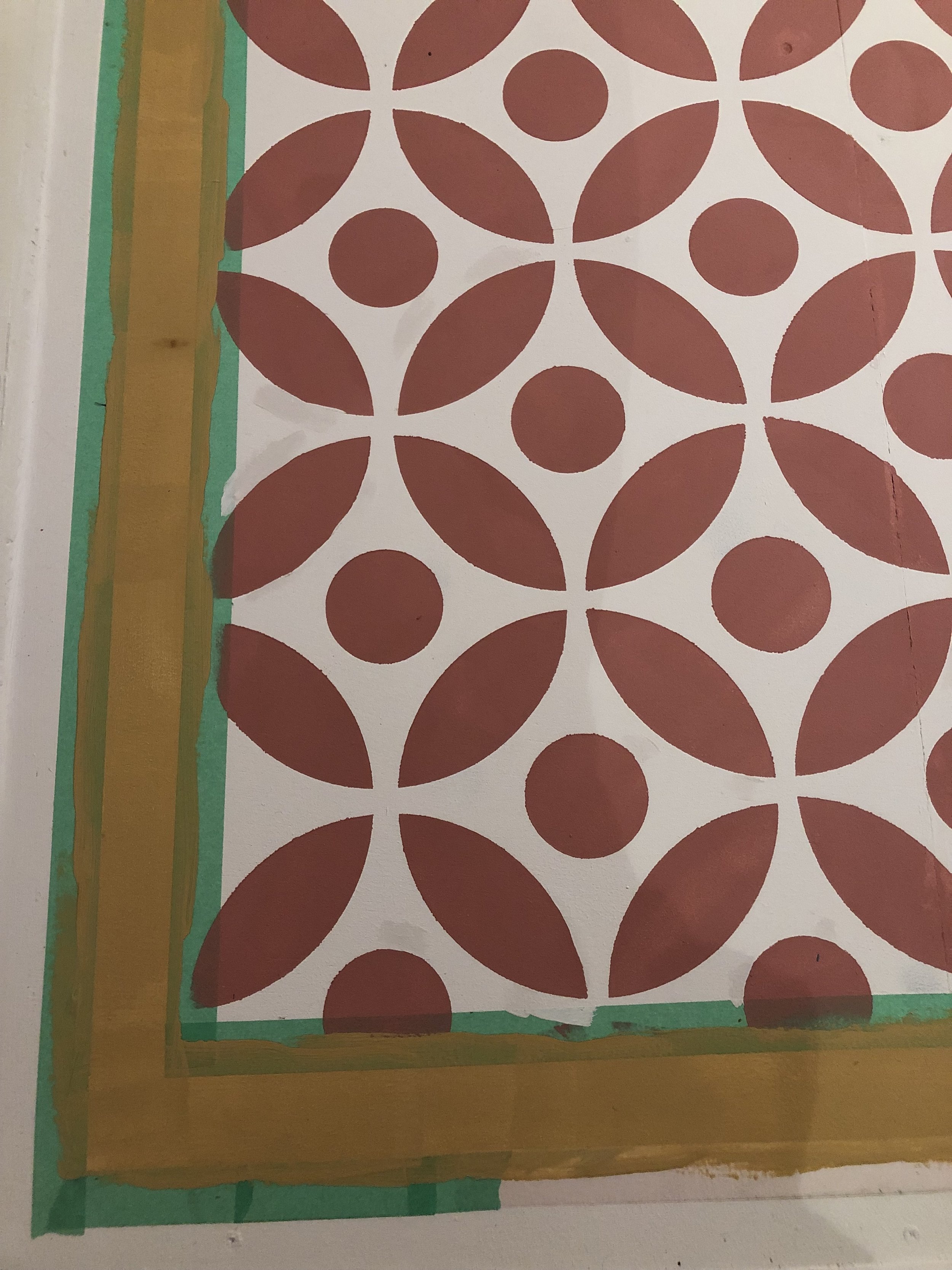
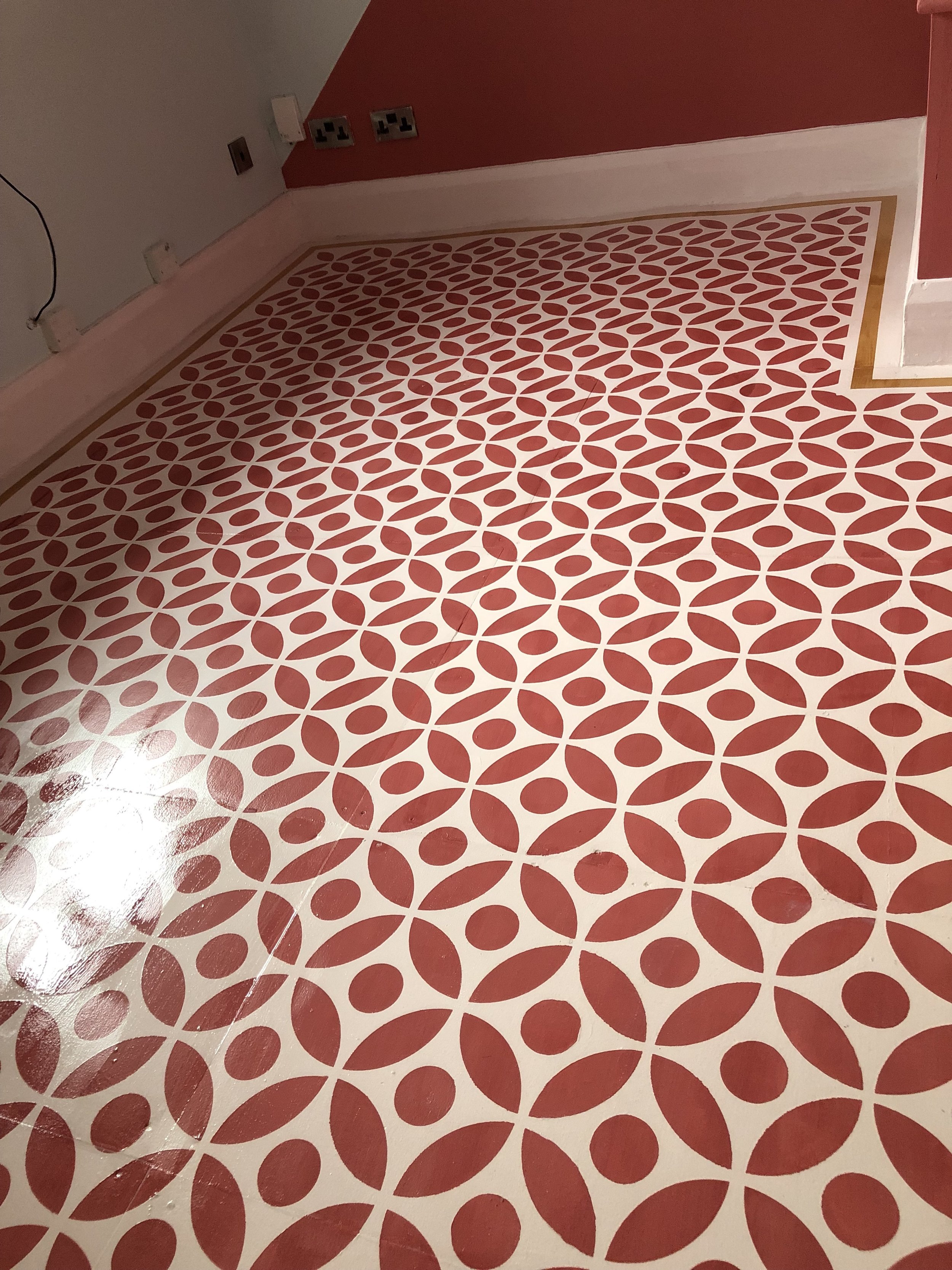
As promised in my earlier Office Plans blog post , the floor got the funky stencil treatment. Mr. Patterned Palace, though not a huge fan of DIY, very kindly covered the dodgy old floorboards for me with some ply board. I then proceeded to give it two coats of claypaint in my base colour, then masked off a border to avoid the need to stencil into awkward corners . Although a complete novice to stencilling, after watching a couple of youtube tutorials and getting lots of advice from the girls a Dizzy Duck Designs, I actually found it a really easy process. After completing the main colour, I masked off a second border and painted in a contrasting stripe. I then protected the whole floor with 4 coats of specialist, quick drying floor varnish. Et voila! A finished floor that looks completely brilliant….even if do say so myself!
On the ceiling.
After being inspired on Instagram by mural artist, Anna Procter, I decided to paint a ceiling rose around the new light fitting. I created a simple flower template reminiscent of the Orla Kiely Flower Spot design, and painted freehand on the ceiling. Not my finest work close up, but it looks very effective from ground level!
Wallpaper.
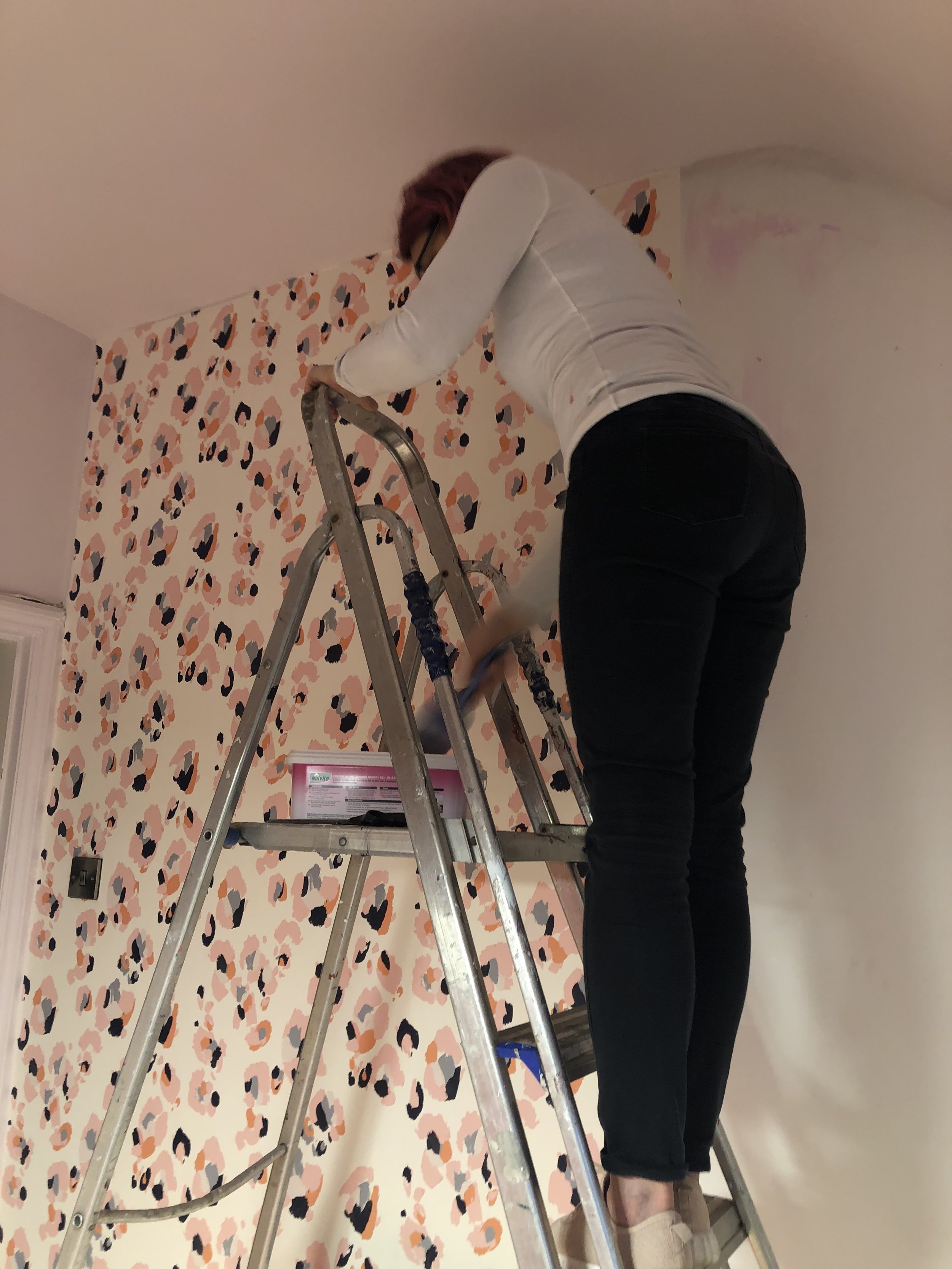
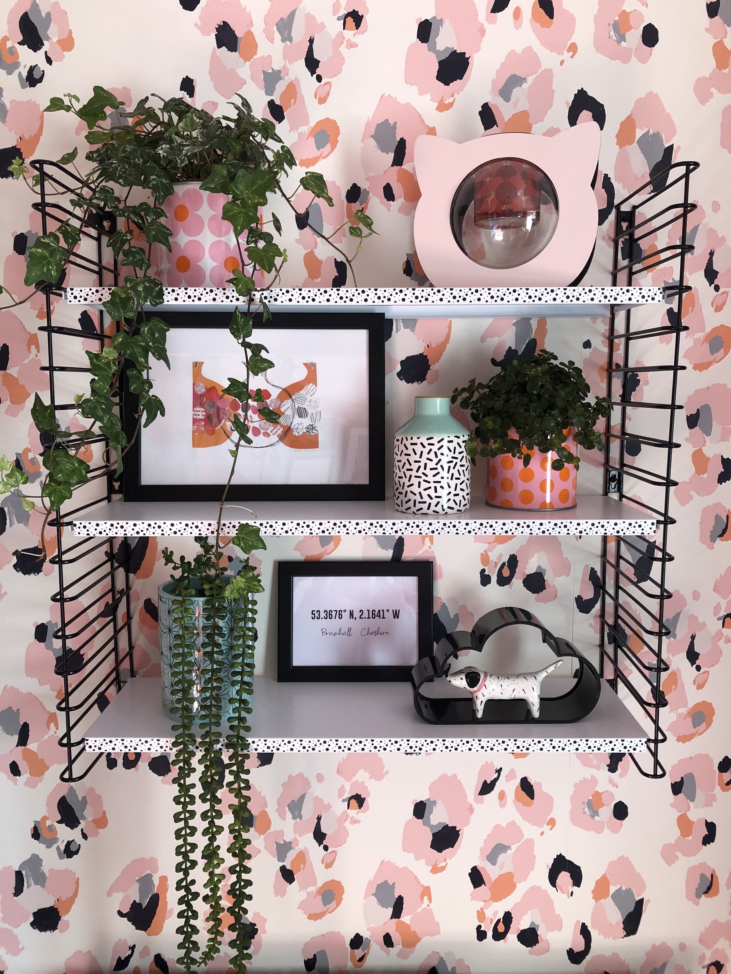
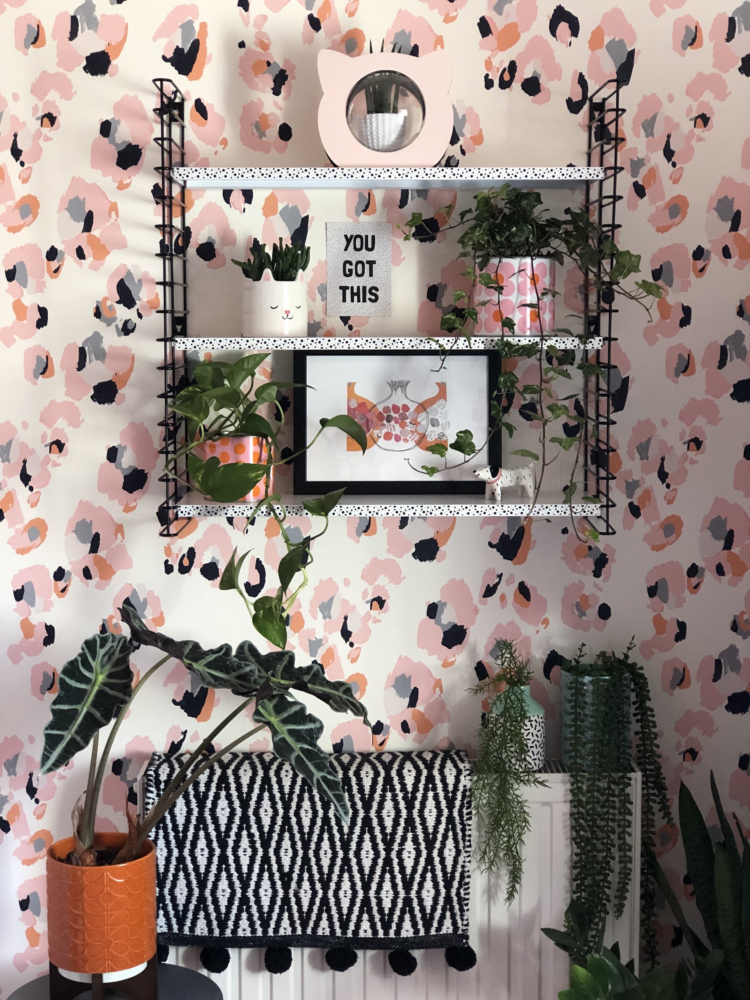
When all the painting was complete, with the help of my daughter & partner in crime @_dansoninthestreet_ we set to hanging my pride and joy, Eleanor Bowmer wallpaper. We smashed it within a couple of hours, even though there was not a straightforward drop! Every piece had a light switch, radiator gubbins or a sloping ceiling to contend with but we managed them all, like real pros!
Storage.
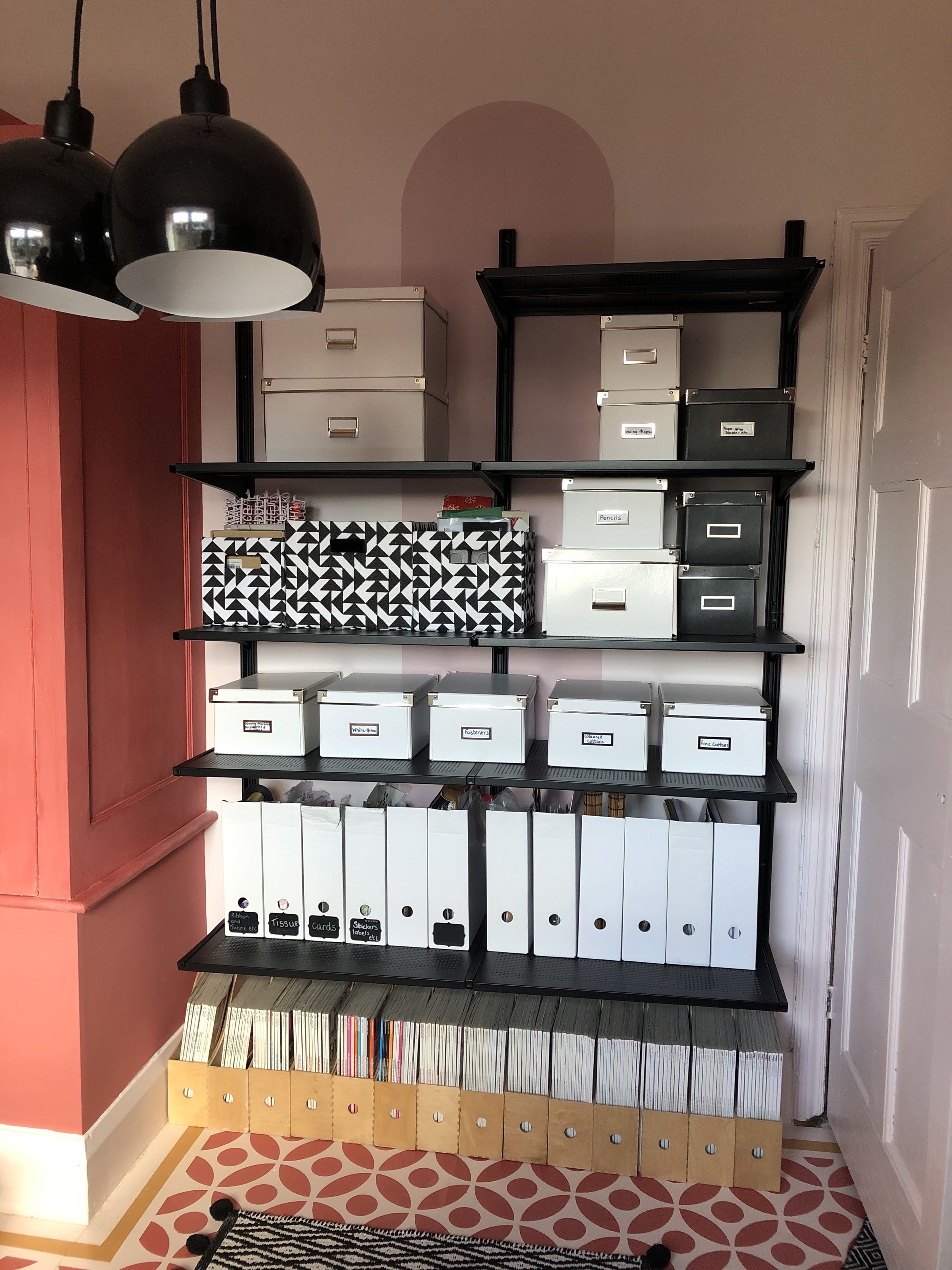
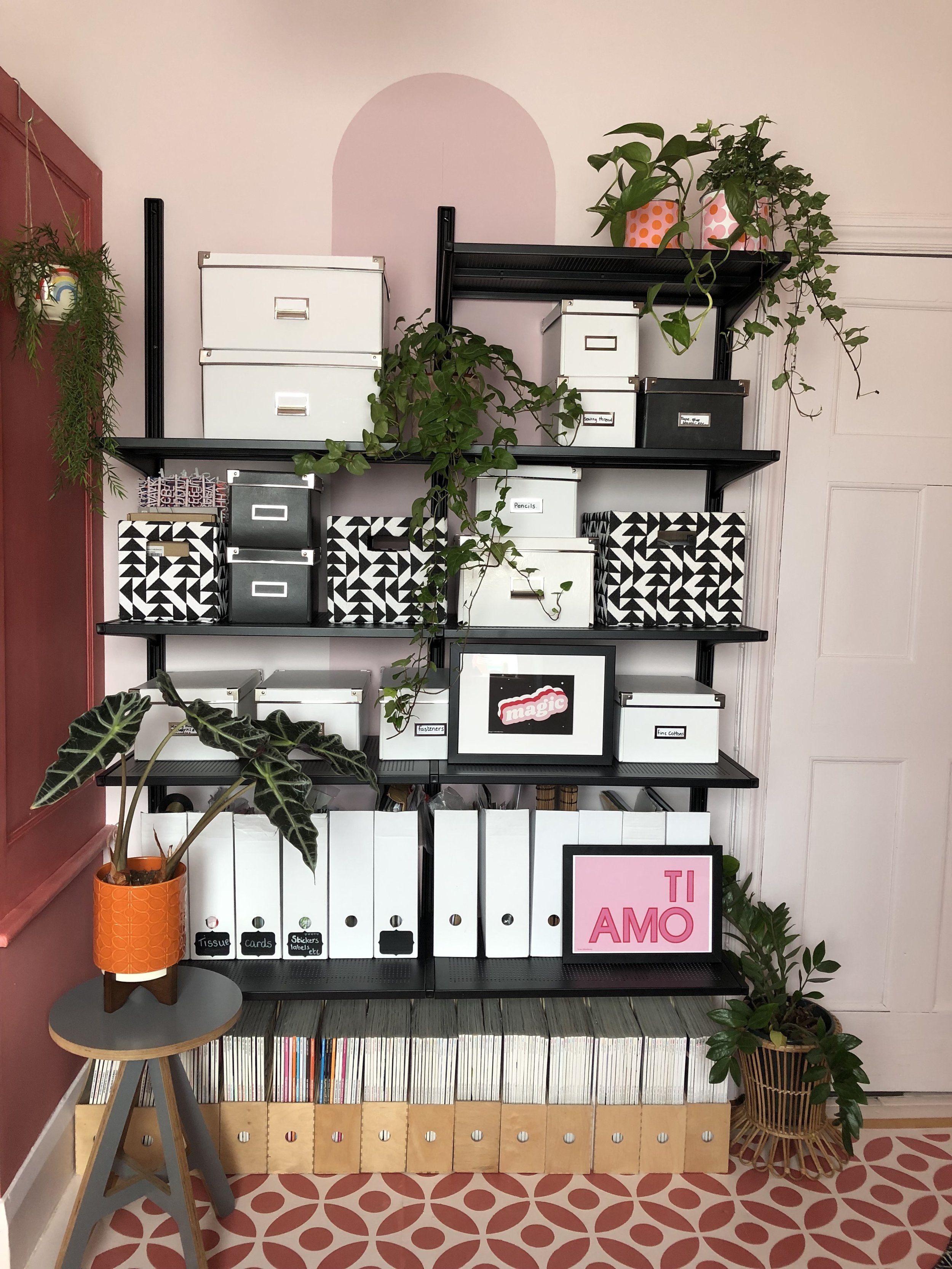
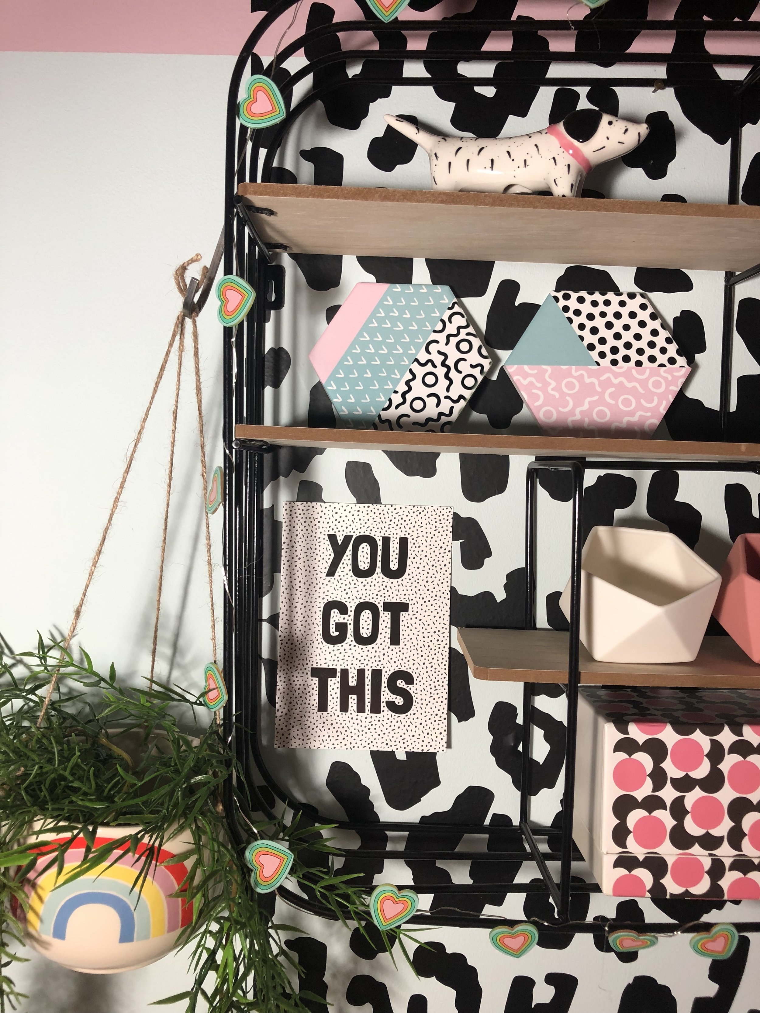
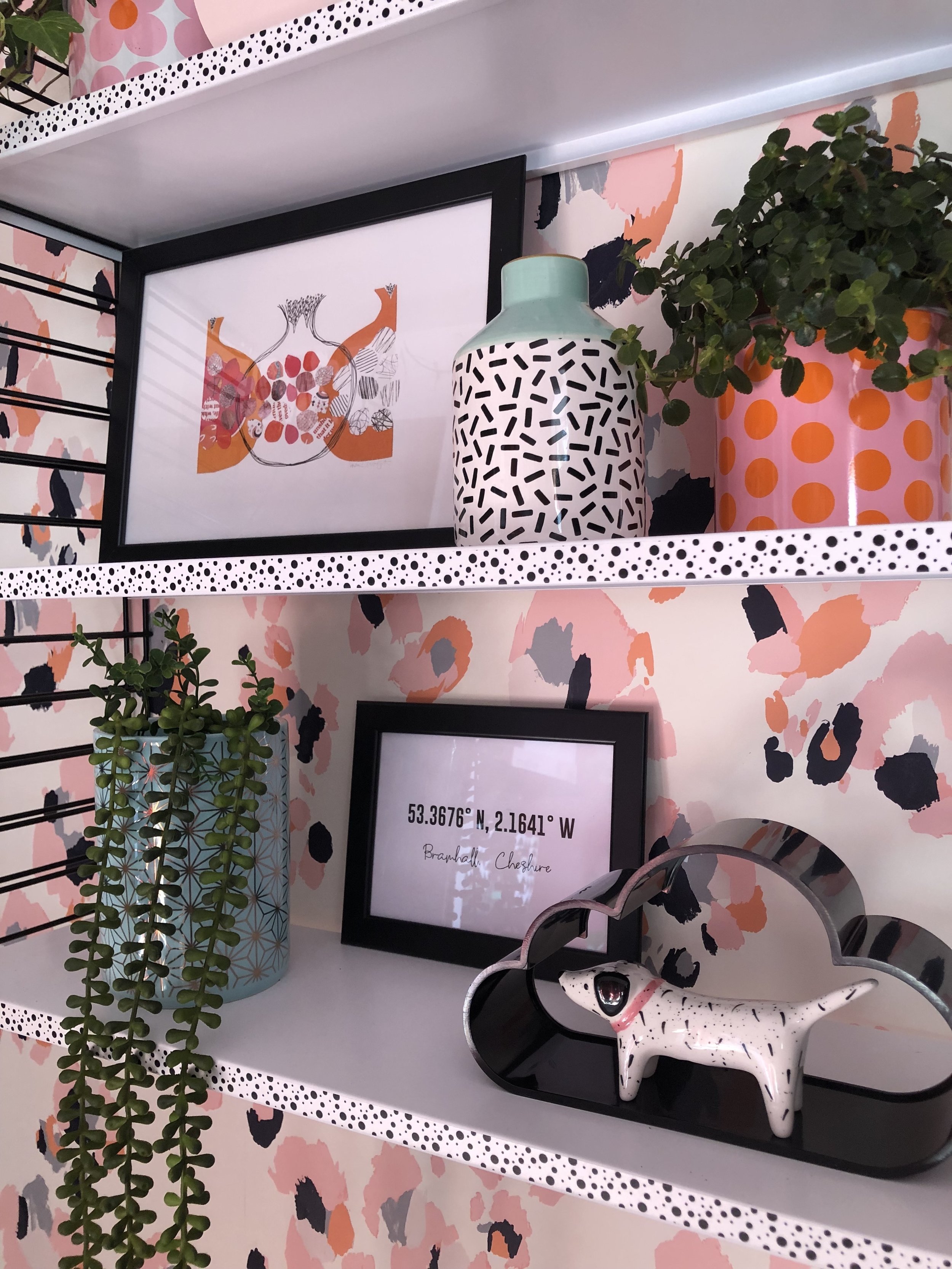
Again, as in my original plan, I used some simple Ikea shelving to provide some much needed storage. I decided on going for the full system in a black colour way, which I think gives a really good contrast against the pastel coloured walls. I have carried this contrast through using all black picture frames in my gallery wall and of course the black leopard spot wall decals. I opted for a couple of small shelving units too, that are useful for displaying pictures, plants and pretty bits and bobs that can be easily changed around as and when I feel like it!
The Gallery Wall.
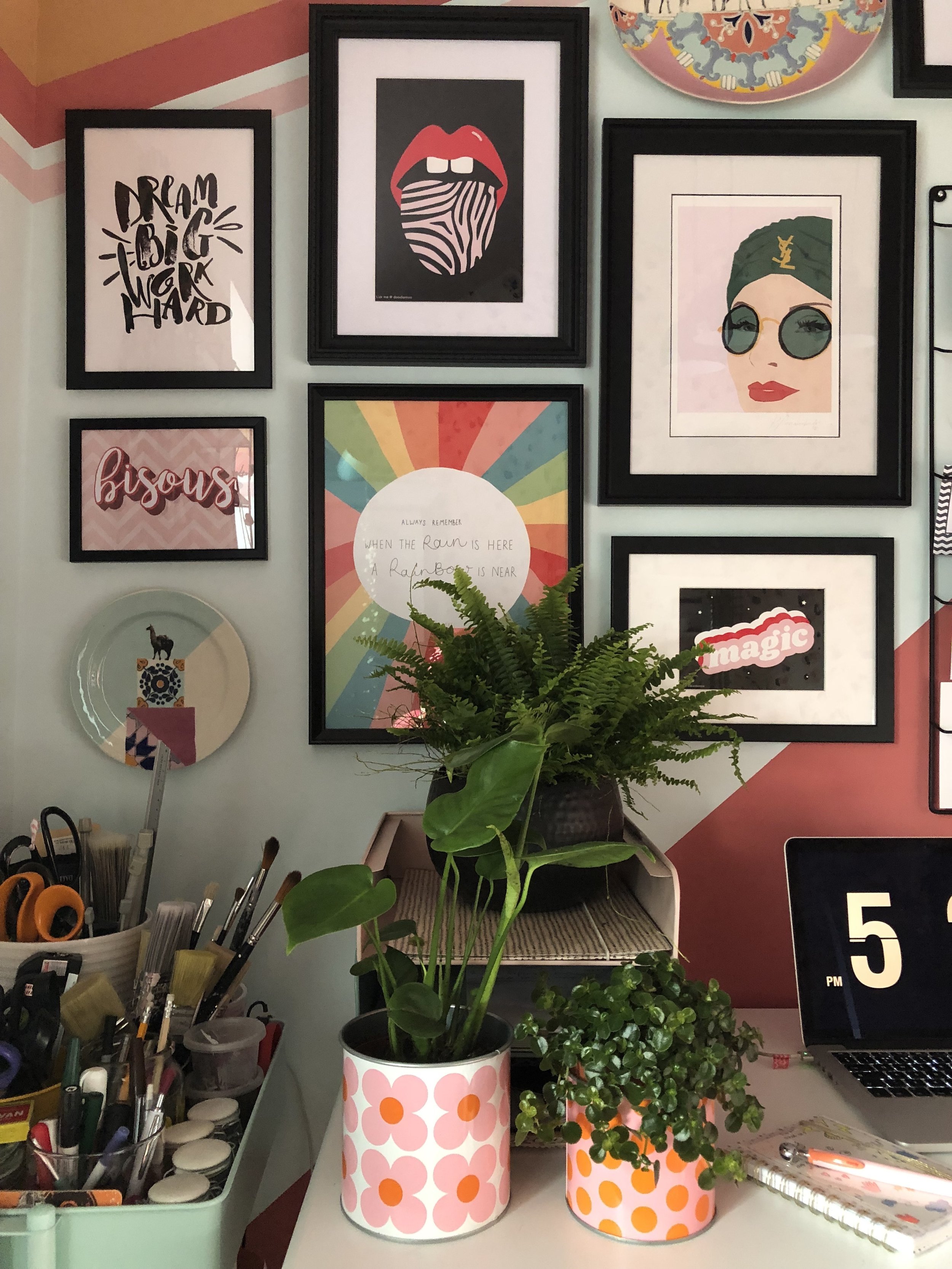
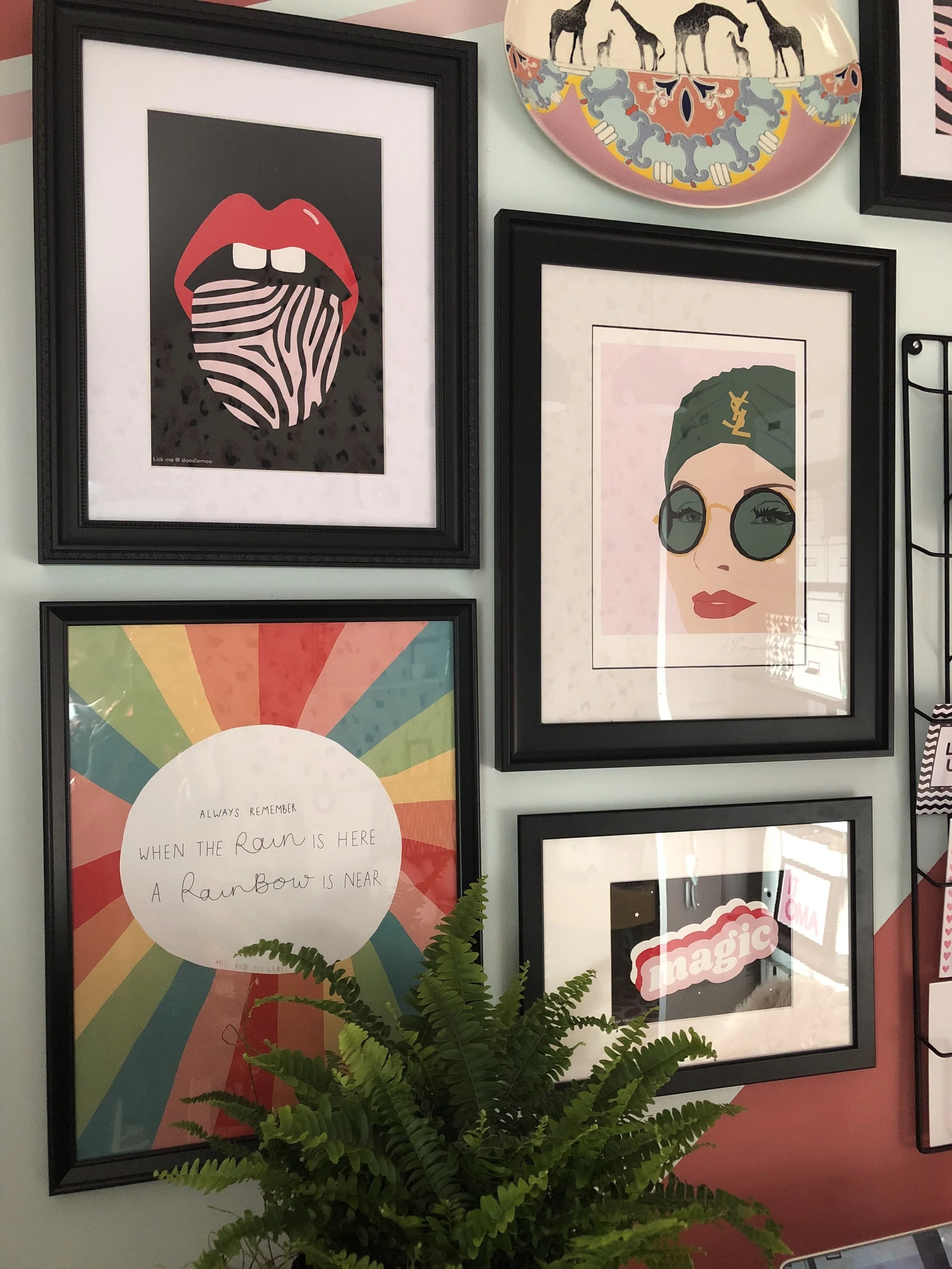
Finally I created my Gallery Wall. I managed to get all the artwork I’d been collecting, framed, using an a mixture of frames from Ikea and online framing company eFrame. I roughly mapped out the arrangement of my pictures and ceramics on the floor, shuffling it around until I was happy with how it looked, then set about hanging them all up, using a mixture of picture hooks and Command strips. I incorporated a wirephoto holder, useful for displaying small prints, photos and postcards, that can be easily changed.
I’m absolutely delighted with the finished results in my office and am certain I have succeeded in my aim to produce a workspace that’ll inspire me creatively and make me massively more productive. I mean, hey, look at me, smashing out my first blogpost sitting at my desk, it’s obviously a job well done!
It’d be great to know what you all think of my little office project, so please feel free to leave your comments below.
TTFN
Soozi x
** This room revamp was part of a paid collaboration with Earthborn paint and eFrame. It also includes gifted items from Dizzy Duck Designs and Nutmeg wall art. The gallery wall includes artwork kindly gifted by Doodlemoo, Karina Mansfield and the13prints

